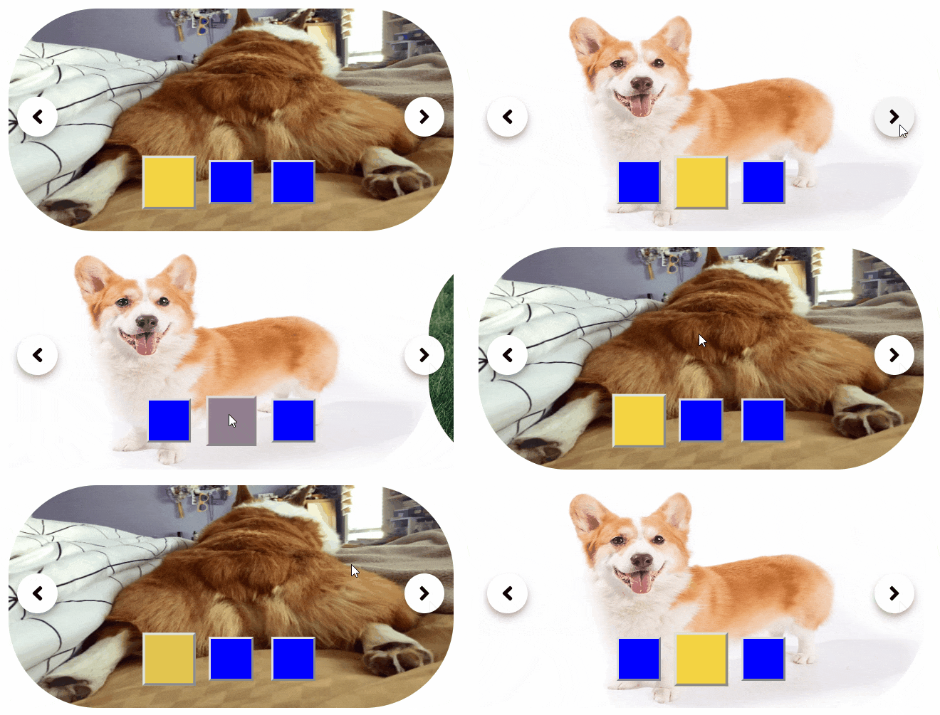
Yet another React Simple Image Carousel
Edited on 25 August 2020. Originally posted on 2 September 2018.
Description
react-simple-image-carousel is an image carousel component for react.

Install
- Node
node install --save react-simple-image-carousel- Yarn
yarn add react-simple-image-carouselBasic Usage
import { Slider } from "react-simple-image-carousel";

<Slider
    width={450}
    height={250}
    maxSwipeThreshold={250 * 0.15}
    minSwipeThreshold={40}
    swipeTimeThreshold={200}
    images={[
        "https://www.chewy.com/petcentral/wp-content/uploads/2018/05/lucky-corgi-butts-x-596-444x.jpg",
        "https://s3.amazonaws.com/cdn-origin-etr.akc.org/wp-content/uploads/2017/11/12225919/Pembroke-Welsh-Corgi-On-White-01.jpg",
        "https://upload.wikimedia.org/wikipedia/commons/thumb/f/fb/Welchcorgipembroke.JPG/1200px-Welchcorgipembroke.JPG",
    ]}
/>;
Props Descriptions
widthandheightare defined in terms of pixels.maxSwipeThresholdis the maximum pixels for an image to be swiped left or right to be considered aswipeaction.-
minSwipeThresholdandswipeTimeThresholdare defined for quick swipes. When these two factors are true, then it shall be considered aswipeaction.minSwipeThresholdis the minimum pixels for an image to be swiped left or right.swipeTimeThresholdis the millisecond for the gesture to happen.
Customisation

<Slider
    width={500}
    height={250}
    maxSwipeThreshold={500 * 0.15}
    minSwipeThreshold={40}
    swipeTimeThreshold={200}
    images={[
        "https://www.chewy.com/petcentral/wp-content/uploads/2018/05/lucky-corgi-butts-x-596-444x.jpg",
        "https://s3.amazonaws.com/cdn-origin-etr.akc.org/wp-content/uploads/2017/11/12225919/Pembroke-Welsh-Corgi-On-White-01.jpg",
        "https://upload.wikimedia.org/wikipedia/commons/thumb/f/fb/Welchcorgipembroke.JPG/1200px-Welchcorgipembroke.JPG",
    ]}
    selectorStyle={{
        backgroundColor: "blue",
        height: "50px",
        width: "50px",
    }
    selectorContainerStyle={{
        bottom: "80px",
    }}
    slideStyle={{
        borderRadius: "100px",
    }}
    carouselStyle={{
        borderColor: "black",
        borderWidth: "10px",
    }}
/>
Props Descriptions
selectorStyleis the blue box thing seen in the gif. This customises the style for the slide selector.selectorContainerStylecustomises the style of the container that contains all slide selectors.slideStylecustomises the style of per image slide.carouselStylecustomises the style of the entire container.
Why did I made this?
To experience the flow from package development until NPM deployment. It also has CI and CD rigged up on Travis CI.
Alternatives
At the point of re-editing this article, the author deems this NPM package legacy. Please do not use this in a production application.
Yup, it is true that there are many other react carousel components with more features on NPM. Here are some of them:
There are many others, this is not an exhausting list.